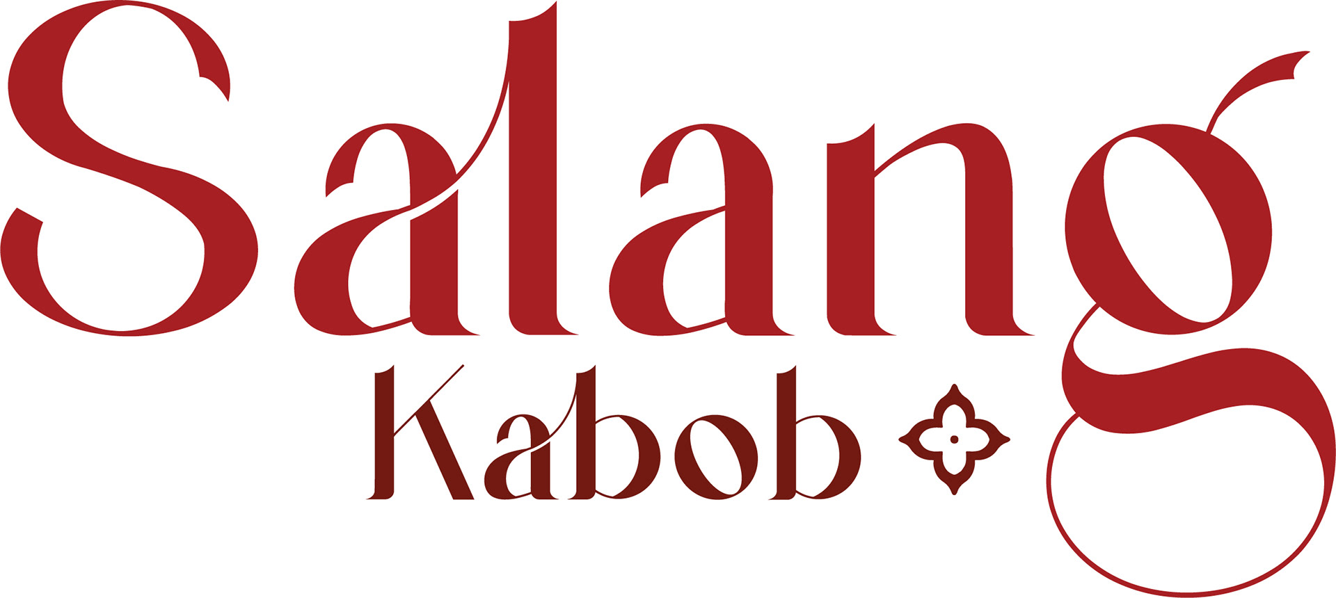
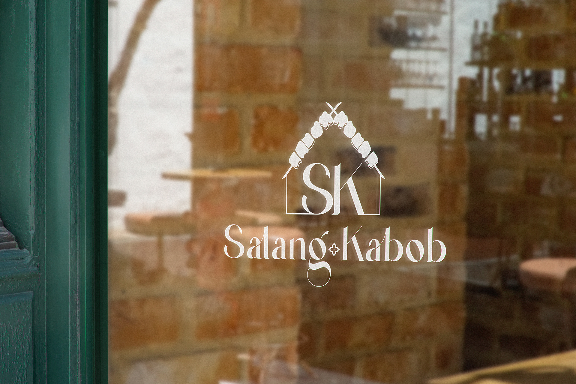
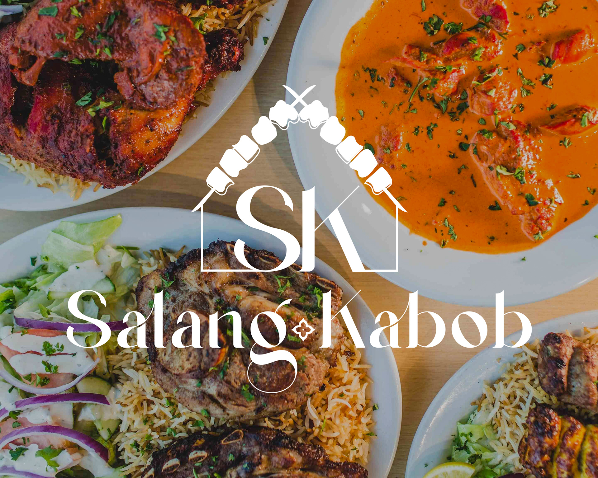
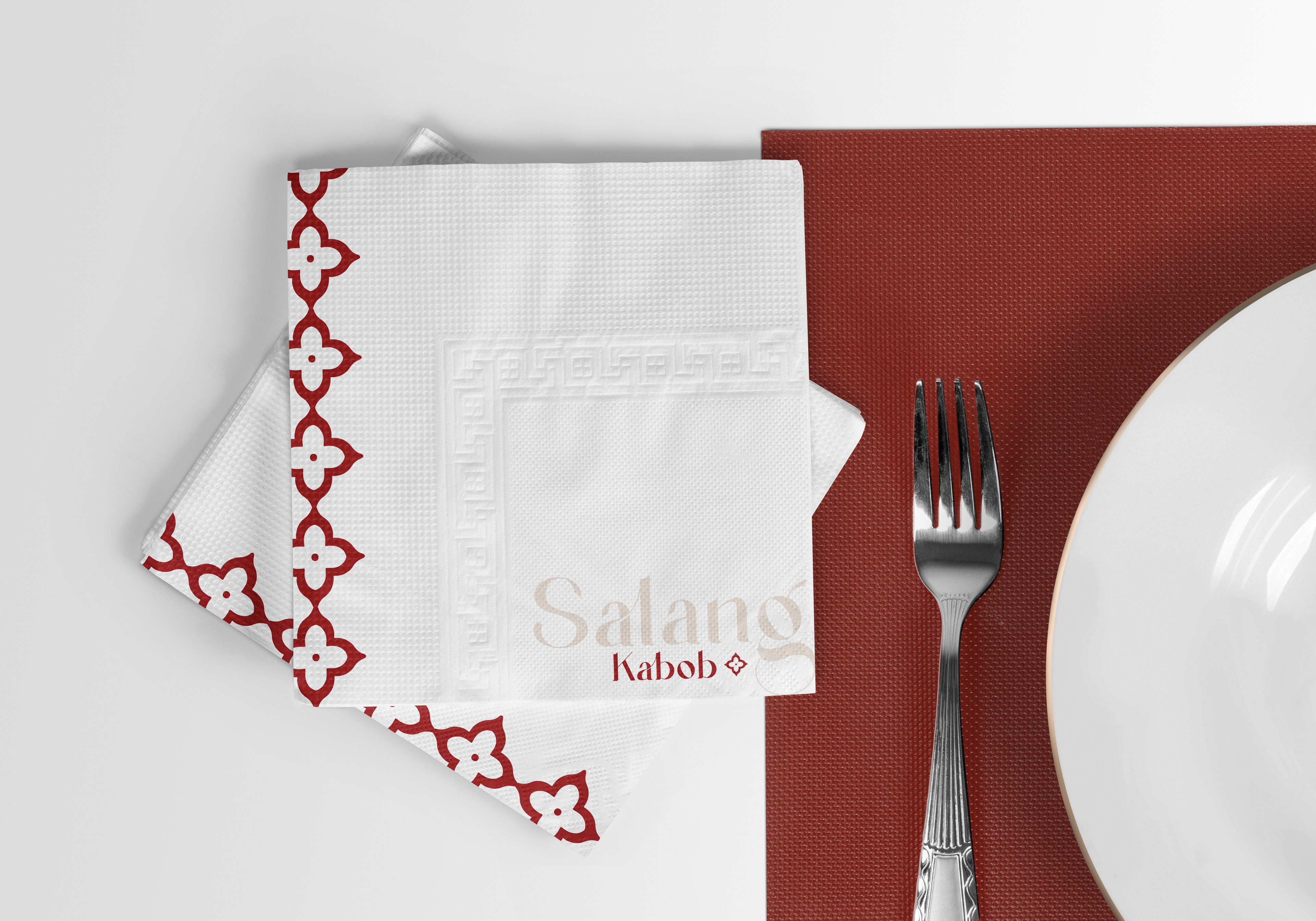
Objective
To create a unique packaging for a new craft beer brand, to allow them to stand out from their competitors on the shelf.  
Process
Being a Maple Leafs fan myself, as soon as the project was briefed, I knew I wanted to go in the direction of hockey. Hockey and beer go so well together,  so it just made so much sense. I wanted it to be enclusive of the different teams, but highlight the most famous players so even non-sports fans would recogize it. One of the problems I ran into during this process was that Sidney Crosbys team wore yellow jerseys. This became an issue because I wanted all the type and icons to be consistent on each bottle, which is why i struggled with the white type against the yellow background.  White type doesn’t read very well on yellow backgrounds, so I needed to change something. After doing some research, I found one of his alternate jerseyes, which was all black with yellow details. It was perfect and I had found my solution. Throughout my process, I knew exactly the direction I wanted to go in. Having the silhouettes of the players with their names showing was the perfect way to capture both audiences. 
Back to Top