Objective
To create a 2 page magazine spread using both text and images.
Process
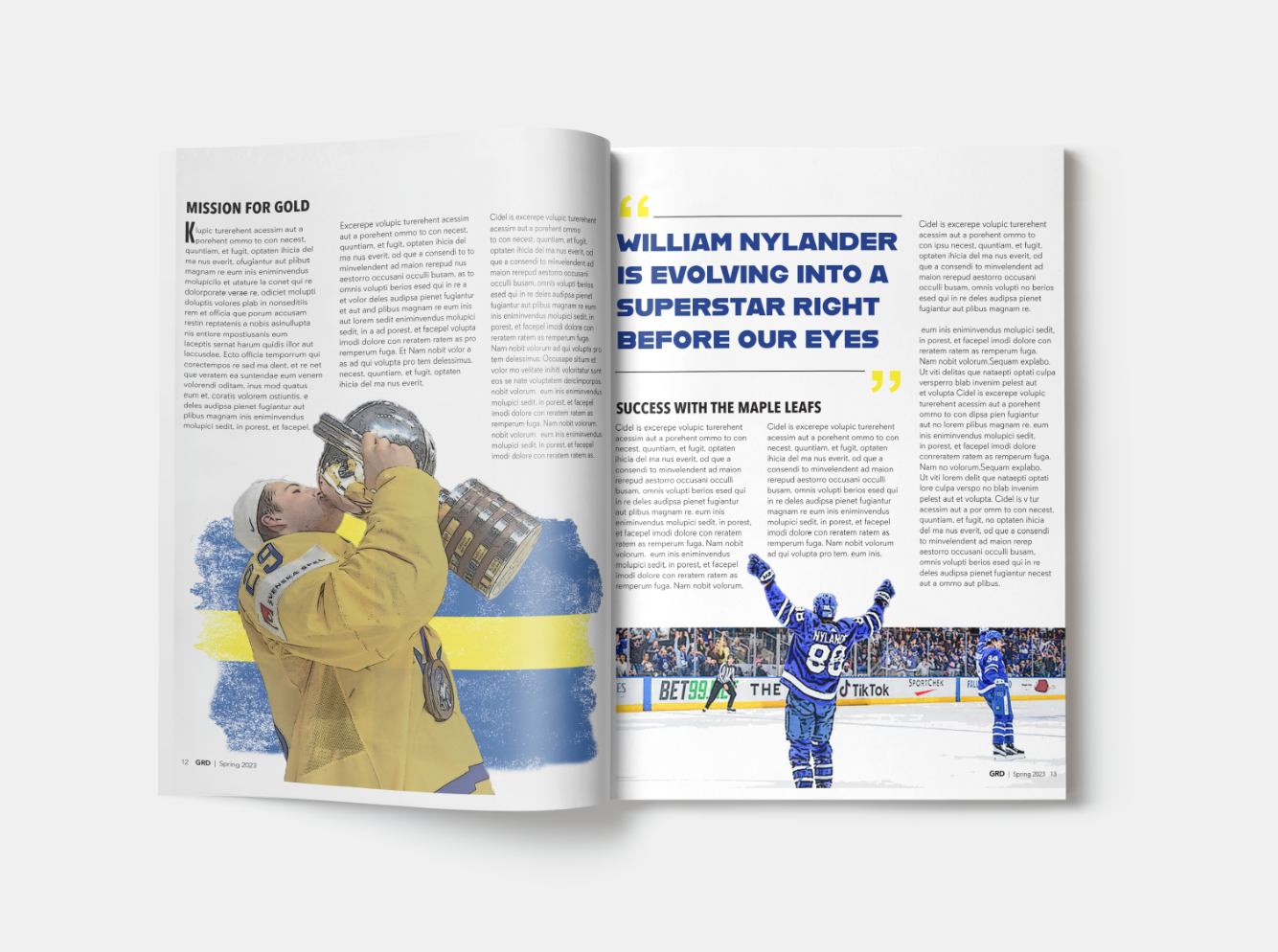
For this 2 page magazine spread, we were instructed to keep the first page with little to no text, while keeping the entire article on the second page. This was one of the first projects I had done where I had to photobash multiple images together in Photoshop. I drew alot of inspiration from hcokey posters and social media ads. I loved the look and feel of a rough sketchy look. I started the process by sketching out a few layout ideas. For the first page, I knew I wanted to incorporate the toronto skyline, as well as photos of William Nylander. After playing around in photoshop, my first draft felt too rough and the images weren’t photoshoped together very well. There was also not enough contrast with the white tyoe and light blue background. On the second page, everything felt very squished and the image of Nylander didn’t quite fit. After editing it some more, I changed the image on the second page to help spread the type around more. I also moved the pull quote over to the right side to help balance things out more. For the first page, I decreased the texture, darkened the background, added the number 88 and the flag of Sweden. With the extra elements it helped tie everything together without being too overwhelming.